

Pantone color report, published this September, brings news of optimism in spring 2010 fashion. “Splashes of sunshine” is next season’s motto inspired by vibrant hues seen on New York runways.
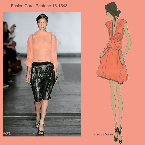
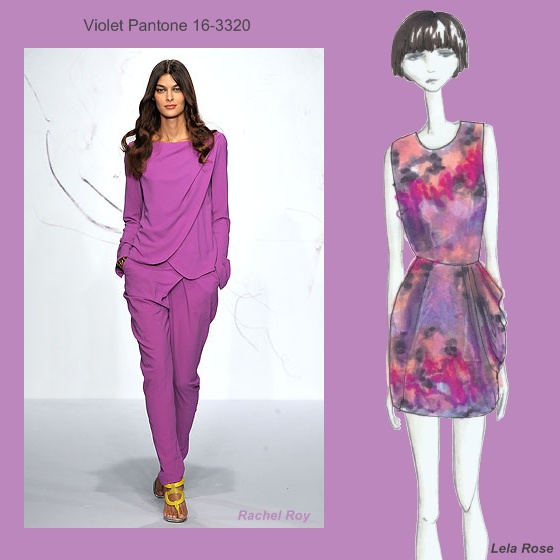
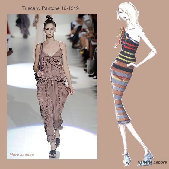
Lively bright shades: soothing Turquoise, Amparo Blue, romantic Violet, gleaming Aurora yellow and refreshing shades of orange (Fusion Coral) and red (Tomato Purée) add a sense of joy while luxurious but practical neutrals (bubbly Pink Champagne, warm beige Tuscany, the ultimate green Dried Herb and the cool gray Eucalyptus) complement what you already own in your wardrobe.
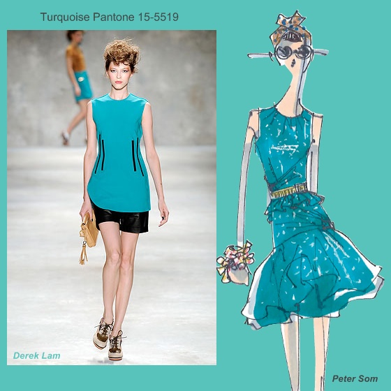

Statement pieces for spring 2010 from New York designers’ perspective are, among oh so many!, the red cocktail dress (Badgley Mischka), a purple jumpsuit (Catherine Malandrino), a blue jacquard sheath “that can take you from day to evening” (Peter Som) or the drapey tie-front tan leather jacket (Erin Fetherston)


The report also gathers thoughts on the modern consumer’s perception of color in fashion. So, for spring 2010, color will be an important "mood lifter" and a great investment tip offering that unique value that everybody searches for.
A very interesting insight is what Cynthia Steffe's designer Shaun Kearney says: "I think spring is about wanting to be carried away by clothes, finding the fantasy in them, but never leaving the ground. The color palette reflects that in fresh, airy, hopeful colors, grounded by a soft shade of Gray that feels ethereal and practical at the same time". That holds true for the other three neutrals, also, I’d add.
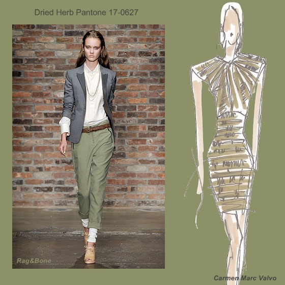
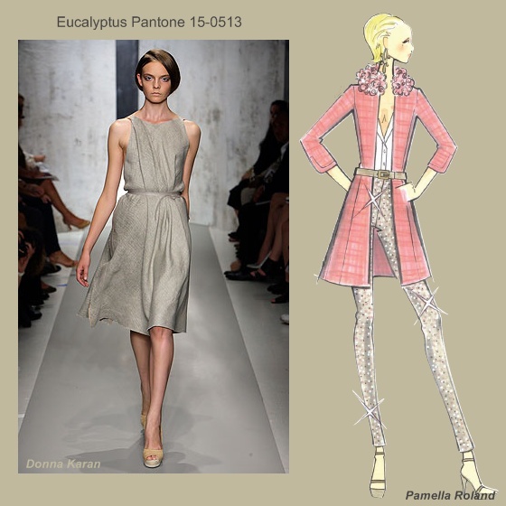
Image source: pantone.com & style.com